An innovative energy company needed a brand that matched their ambition: driving positive change toward a greener future.
Branding
Art Direction
Web Design
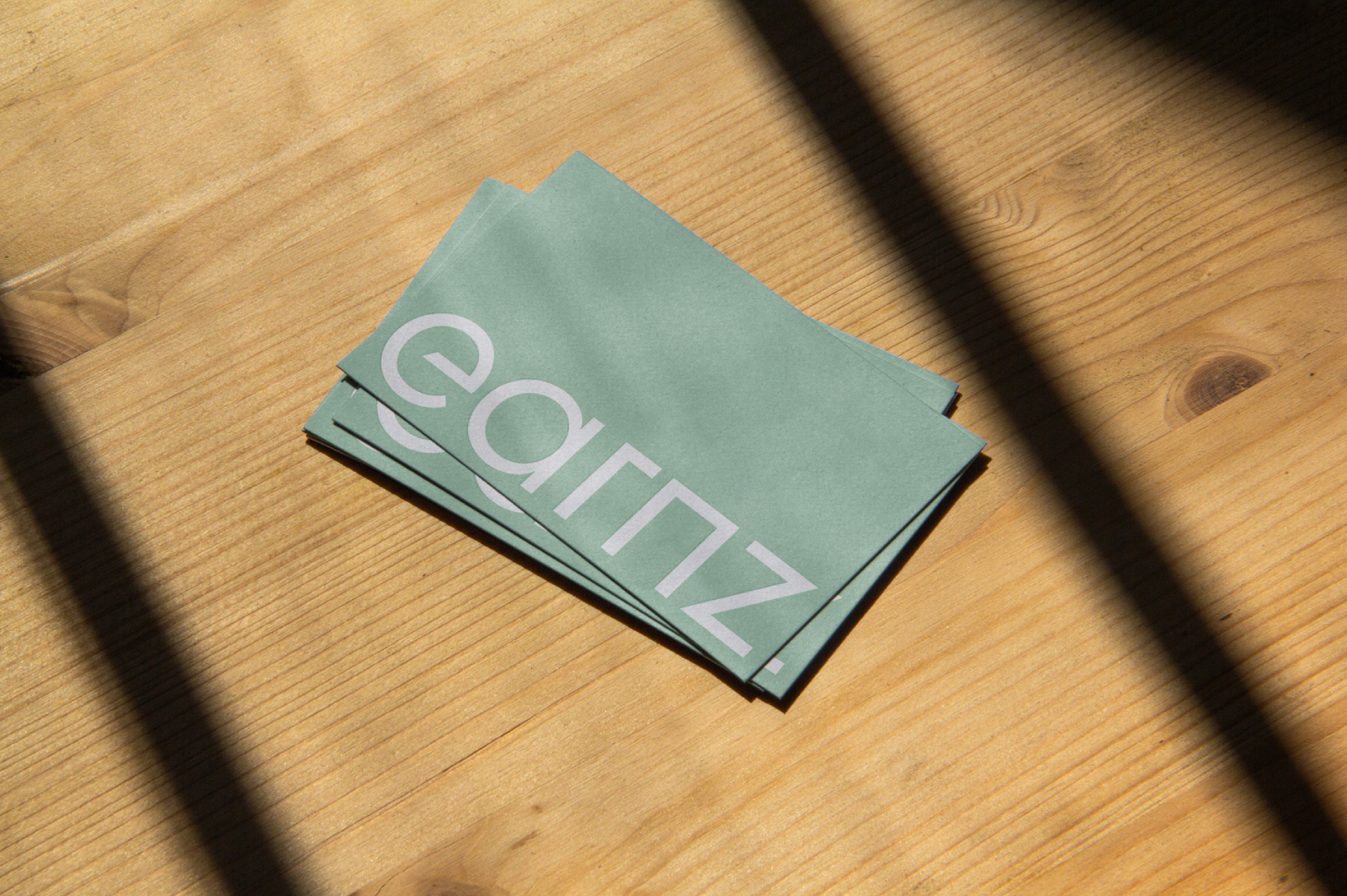
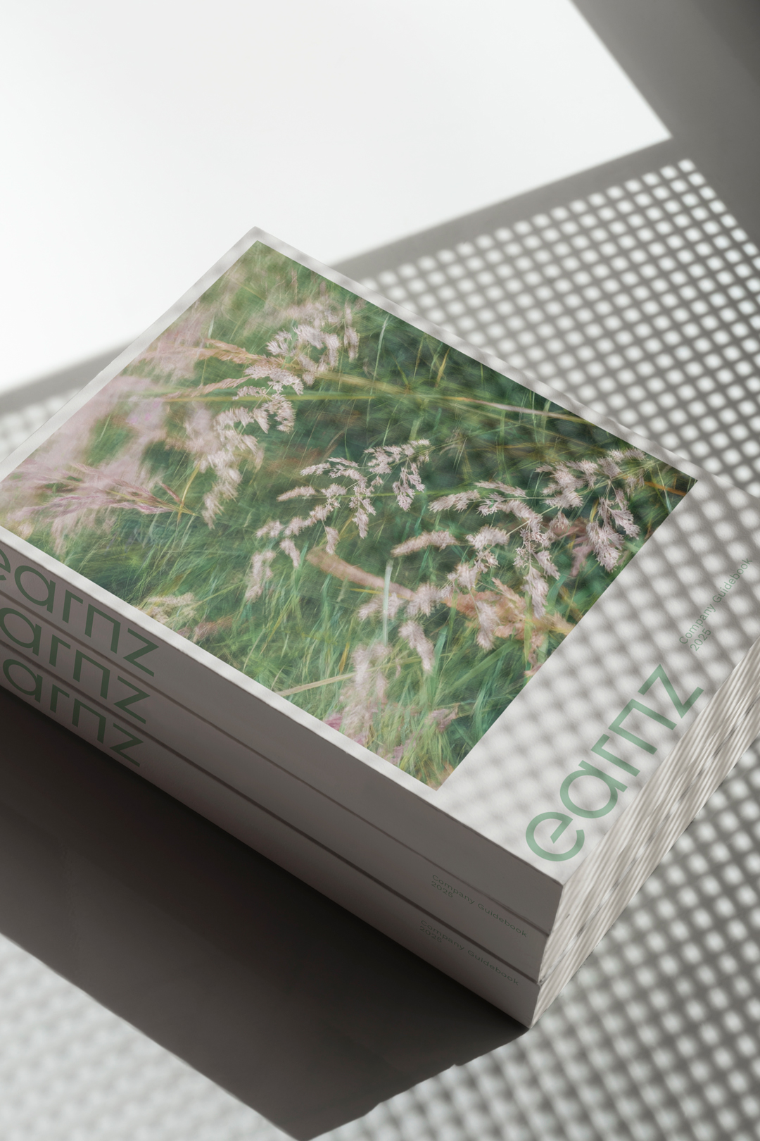
Earnz PLC was building a greener future in the energy sector, but their brand didn’t reflect that ambition. They needed a complete visual refresh — logo, colour, typography and website — that communicated sustainability without feeling corporate, cold or generic, and that could scale as the company grew.
The challenge was trust. Traditional energy brands often feel outdated, while newer “green” companies can come across as superficial. Earnz sits between the two: serious expertise paired with a genuine environmental commitment. The identity needed to express both.
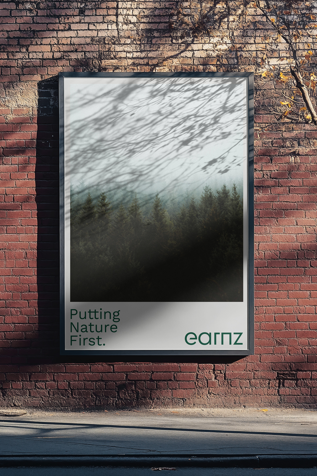
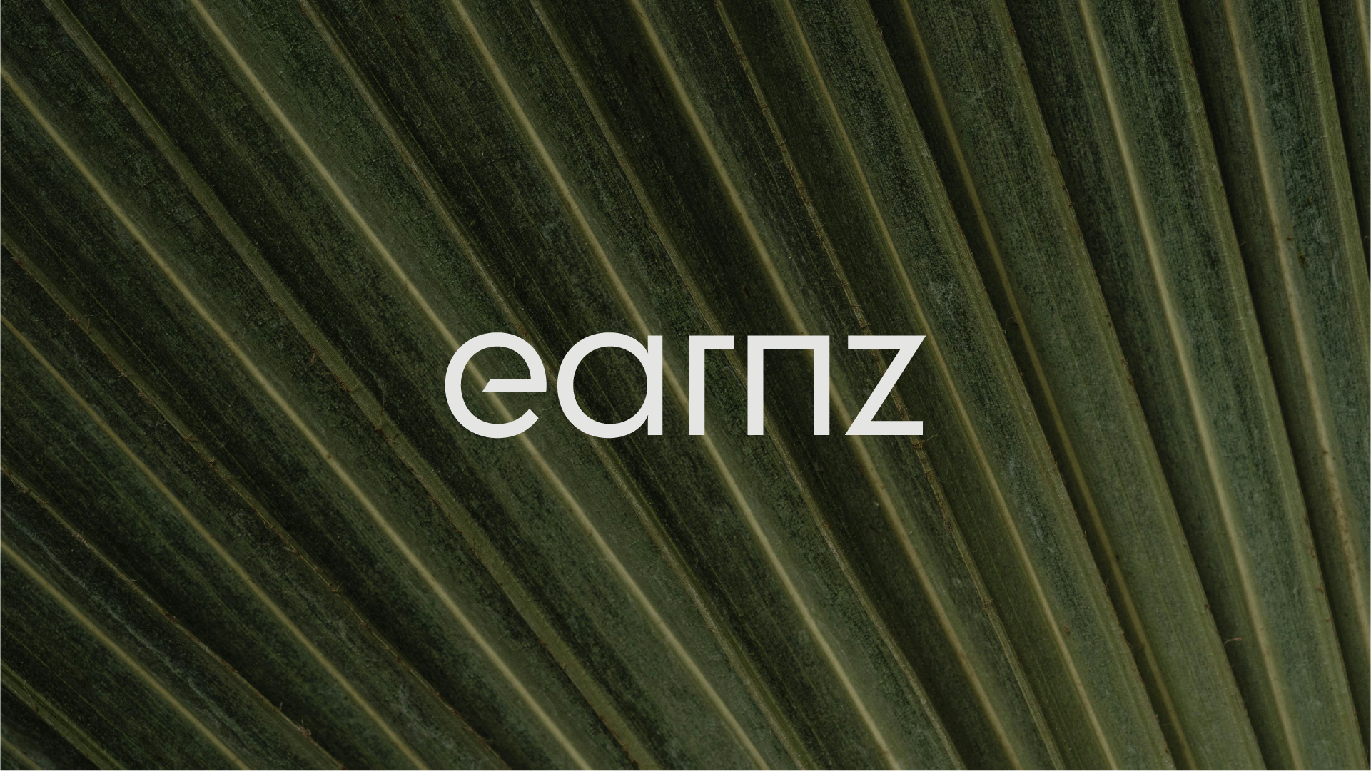
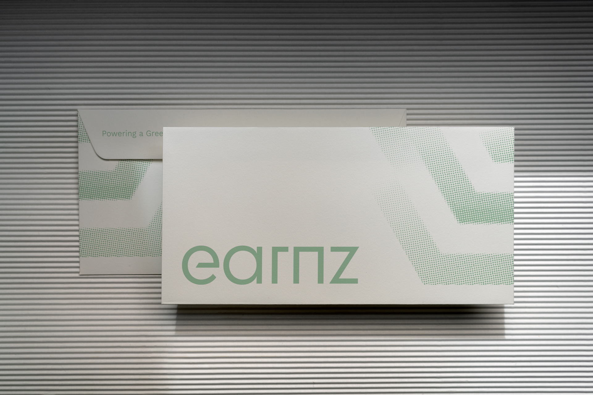
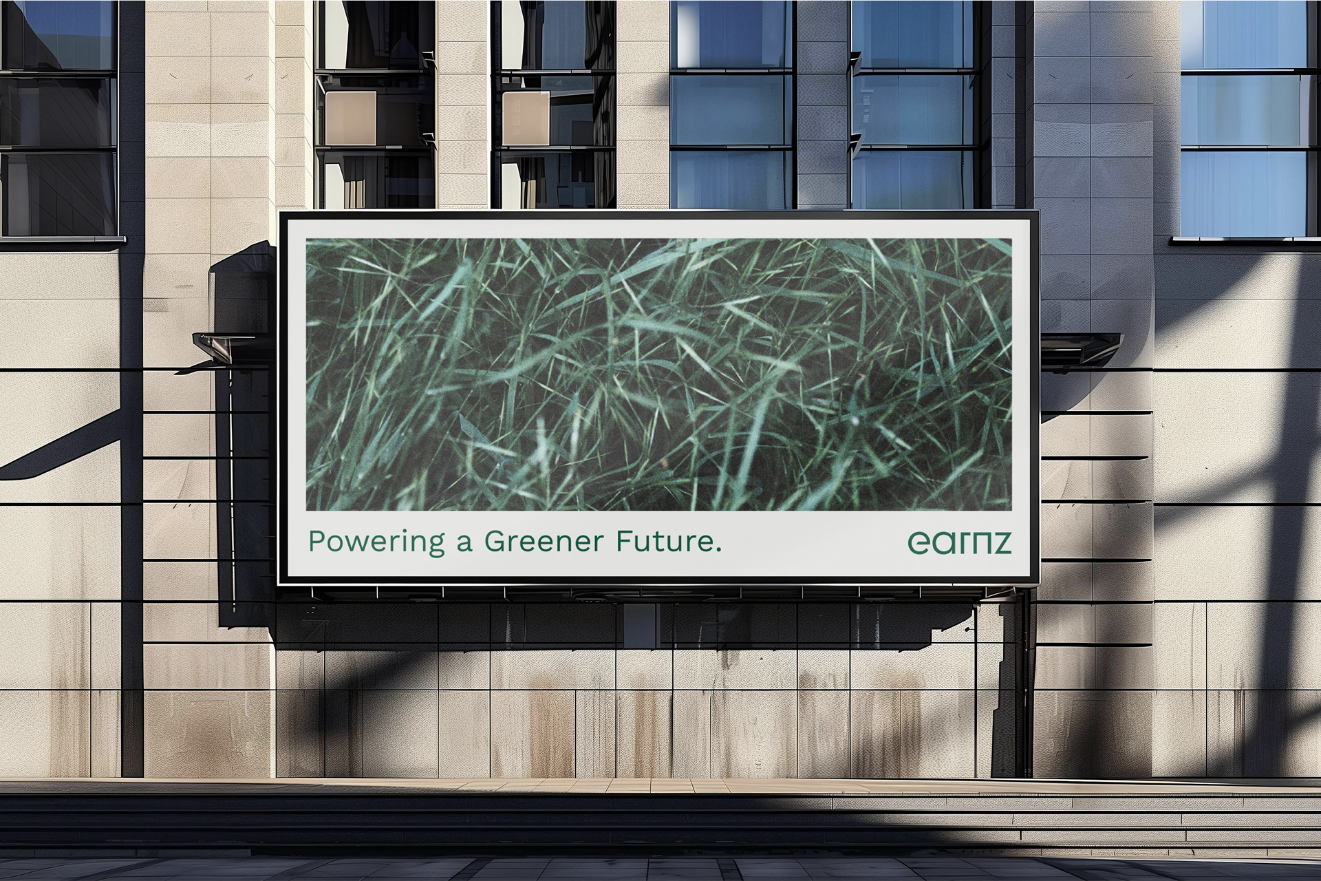
We created a visual system that balances clean, geometric typography with natural texture. Linear patterns reference infrastructure and organic growth, while a lowercase wordmark feels open and approachable, avoiding the aggressive tone common in the sector. Earth-led colours and honest, detailed photography ground the brand in the real world.
The result is a modern, credible identity that feels both professional and human — clear in its purpose, and rooted in Earnz’s mission to put nature first.
Branding, Art Direction: Alex Foxley