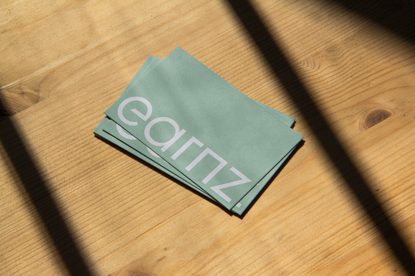
Designing a visual identity that feels professional yet personal.
Branding
Art Direction
Motion Design
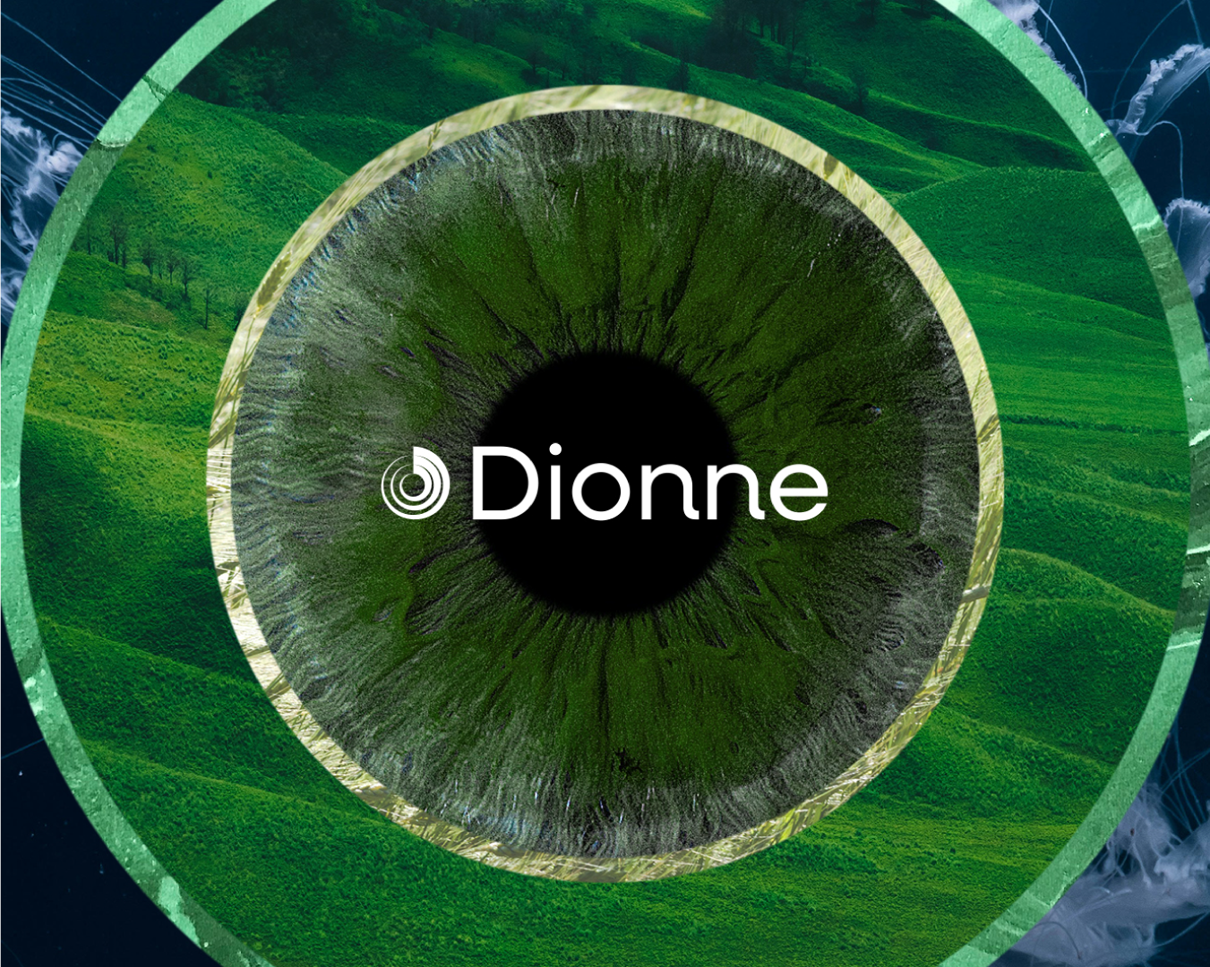
Leadership coaching brands often lean on corporate polish or motivational vagueness. Dionne needed something quieter and more grounded, an identity that felt like the work itself.
The core insight was simple: leadership starts from within. Knowing yourself is what makes other people trust you.
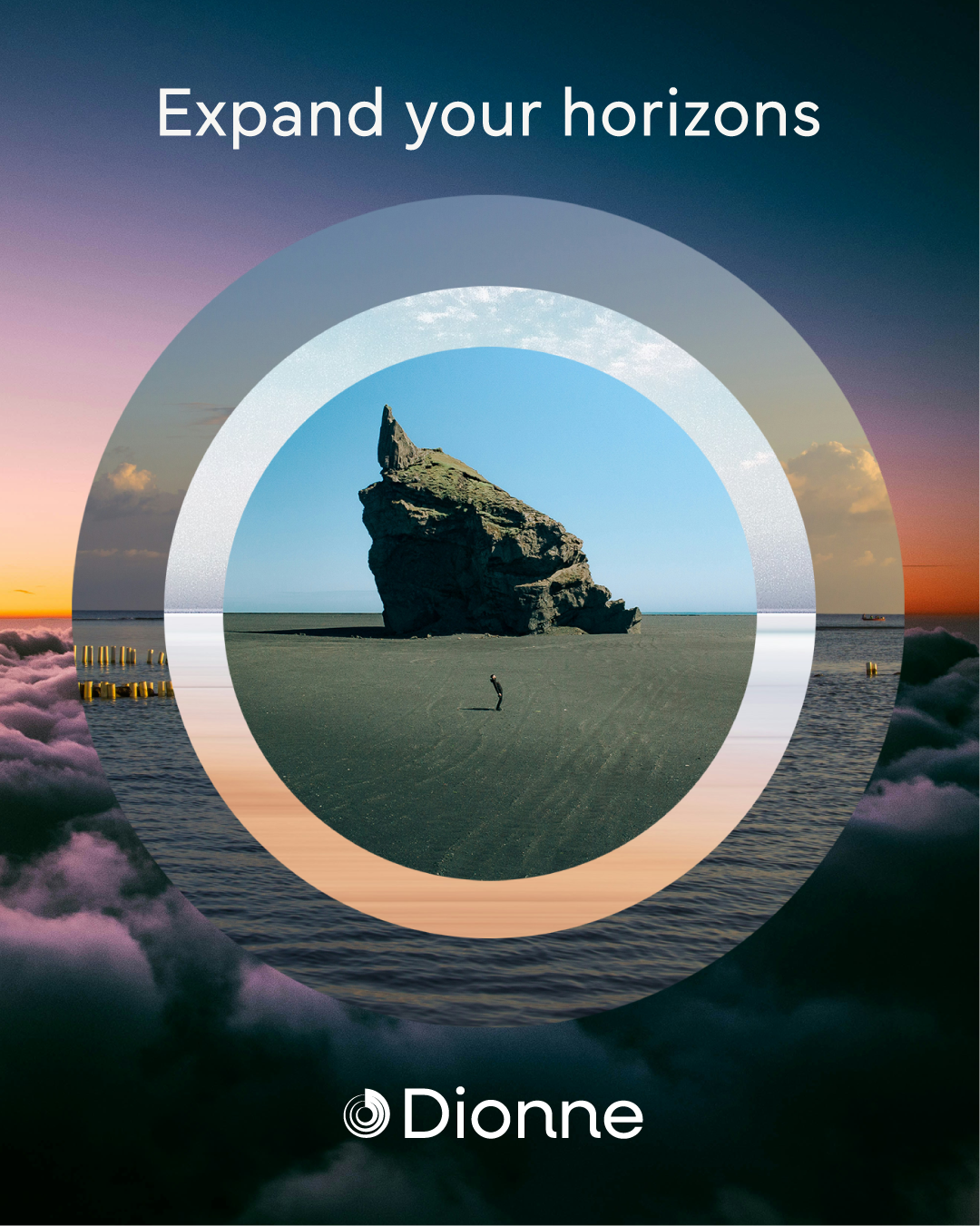
We built the brand around a ripple — a form that begins at a single point and expands outward without announcing itself. The visual language follows the same instinct: calm, confident, imagery that holds the intimate and the vast in the same frame. Because that's what real growth feels like. Something shifts quietly inside, and suddenly everything looks a little different.